

TOOLS
Figma
TIMELINE
2 week sprint
TEAM
Product designer (me!)
Lead product designer
Product manager
Engineering manager
THE BRIEF
Healthline had built one of the most trusted editorial presences in digital health. Over time, the site had started to diversify past editorial content (such as articles) and was looking to find new ways to bring such offerings in front of users. The challenge: modernize the experience and actively guide users toward Healthline's broader ecosystem of tools and offerings.
CONTEXT
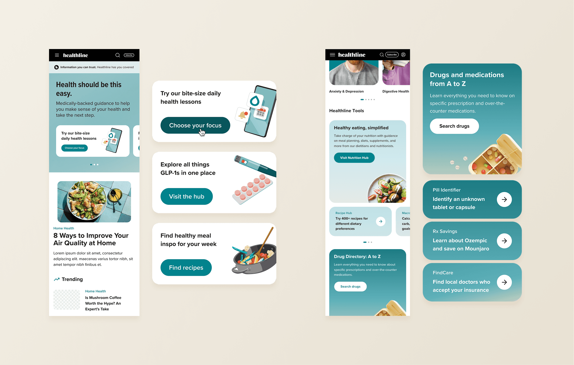
Knowing that 3 in 4 American adults have at least one chronic condition, users arrived at Healthline's homepage typically looking for answers to specific questions. But the page they landed on prioritized article feeds over pathways. Products like Daily Dose (bite-sized condition-specific lessons), recipe content, and condition hubs existed, but users had no clear way to find them from the homepage.
THE PROBLEM
The existing design treated the homepage as more of an editorial gateway. For users who wanted to engage with Healthline's tools and products or find a specific topic feature, they were out of luck.

THE SOLUTION
The redesigned hero introduces three deliberate pathways to Healthline's most sought-after offerings: Daily Dose, recipes, and a GLP-1 resource hub. With a variation that allowed for a single highlight as well, this new placement opens up real estate for marketing teams to feature the latest launches.
Below the hero, newly designed content blocks bring Healthline's health tools onto the homepage for the first time, anchored by a modernized gradient treatment that reflects an updated visual branding overhaul that had begun to rollout on internal article pages.

THE OUTCOME
The launch of the new homepage was met with improvements in CTR and registration rate.
12.1% CTR lift across the entire homepage
28.9% increase in newsletter registrations through the homepage driver
