
Redesigning the core insurance marketplace for Marble
TOOLS
Figma
Maze
Otter
TIMELINE
3 week sprint completed during General Assembly’s UX Design Immersive
TEAM
4 UX design students
THE BRIEF
Client Capstone: validating Marble’s shopping and marketplace flow
Shopping for insurance can surface a number of emotions: frustration, confusion, and exasperation. Marble sought to change that by giving members the tools to consolidate their independent insurance policies in a digital wallet and easily compare rates and coverage.
As a team of 4, we redesigned Marble's insurance marketplace desktop website by identifying points of user frustration and updating their interface to improve how users search and compare insurance quotes.
CONTEXT
Putting Marble’s designs to the test with real users
Marble's shopping partner lacked competitively priced options and users largely associated their long and tedious intake process with Marble, despite it being something they had no control over. As a result, Marble began the process of separating from their shopping partner and designing a potential flow for users to browse insurance options within the Marble site.
However, they did so without conducting any user research or conducted any usability testing and were unsure if their “shopping cart” concept would resonate with their members.
INSIGHTS
Uncovering points of friction with users
To establish a baseline understanding of Marble's existing "Shop" screens, we conducted three rounds of usability tests with 35 total participants,. This allowed us to get an idea of what was or wasn't resonating with users when trying to complete the tasks associated with Marble's key "Shop" features: open shopping carts and set a reminder.
We also wanted to evaluate members' clicking tendencies to see if they were drawn to click on "Get Quote", an integral aspect of Marble's revenue stream.
We saw that all of the participants had difficulty connecting a shopping cart with browsing for insurance options and skipped the feature completely.
Marble’s set a reminder functionality served an integral part in motivating members to return to Marble to do their shopping at a later time. Usability participants had a hard time locating the CTA to initiate the process because it was only accessible on the "Shop" page. We noticed that most participants looked for it on the Home page, then searching under "Tools" or their account.
THE SOLUTION
A cleaner insurance marketplace landing page with clear pathways to search
Utilizing Marble’s existing design system, we delivered a solution to meet the needs of both existing and prospective users and aligned with their mental models related to the insurance shopping experience. Key features included:
Saved quote searches for shoppers to pick up right where they left off
Integrated insurance information into the shopping experience from Marble’s “Insurance Insider”
Good deal rating to help members make an informed decision on their next purchase

HOW IT PERFORMED WITH USERS
More focused clicks and faster task completion in unmoderated testing

Marble’s original layout

Redesigned quote search layout
Clicks on our redesign (right) were much more concentrated and darker where we wanted them to - in creating quote comparisons. This meant fewer misclicks and that the majority of participants were being directed to the right areas of the page.

Time on task also decreased by 37 seconds, meaning that there was less hesitation when landing on the new "Explore Quotes" page and participants were able to quickly determine their next step.
THE OUTCOME
Simplifying how members search and compare quotes
We observed 42% more direct task completions
Participants completed tasks 38 sec faster
Participants gave our flows a 4.4/5 easy rating (compared to 3/5 before the redesign)
“In the coming months we will be prioritizing the implementation of Stephanie’s work and given the research already done, I’m excited and confident about the impact it will have on our product conversion and satisfaction.” — Stuart Winchester, Marble CEO
Creating a pill identifier tool that generated over 10K visits in its first month.
TOOLS
Figma
TIMELINE
1 month
TEAM
Product designer (me!)
UX researcher
Product manager
Tech lead
THE BRIEF
Pill identification was a gap in Healthline’s tool offering
Build a native pill identifier tool that could compete in the space and serve users who needed to identify an unfamiliar medication quickly and confidently.
CONTEXT
A well-established category with room to do it better
Users searching to identify a pill were landing on competitor tools instead of Healthline. With strong domain authority in health content but no dedicated tool in this category, Healthline was missing an entire segment of user intent. This was both a product gap and an SEO opportunity.
INSIGHTS
A usability study run on competitor tools uncovered a few key insights.
Rigid input was a barrier
Competitor tools required imprint information in a fixed order. Users who entered it differently ended up with no results.
Imprint should take precedence
When imprint matched, users expected results even if color or shape filters didn't align.
Users needed guidance
Most people didn't know what "imprint" meant. Explainer text was essential to reduce drop-off at the search step.
THE PROBLEM
Identifying a pill can be difficult. The tool shouldn’t be making it harder
Existing tools assumed users knew exactly how to search with standards such as fixed input order, no guidance, and a no results page as soon as one filter didn't match. For users in an anxious or time-sensitive moment, that friction could be a cause for major frustration.
THE SOLUTION
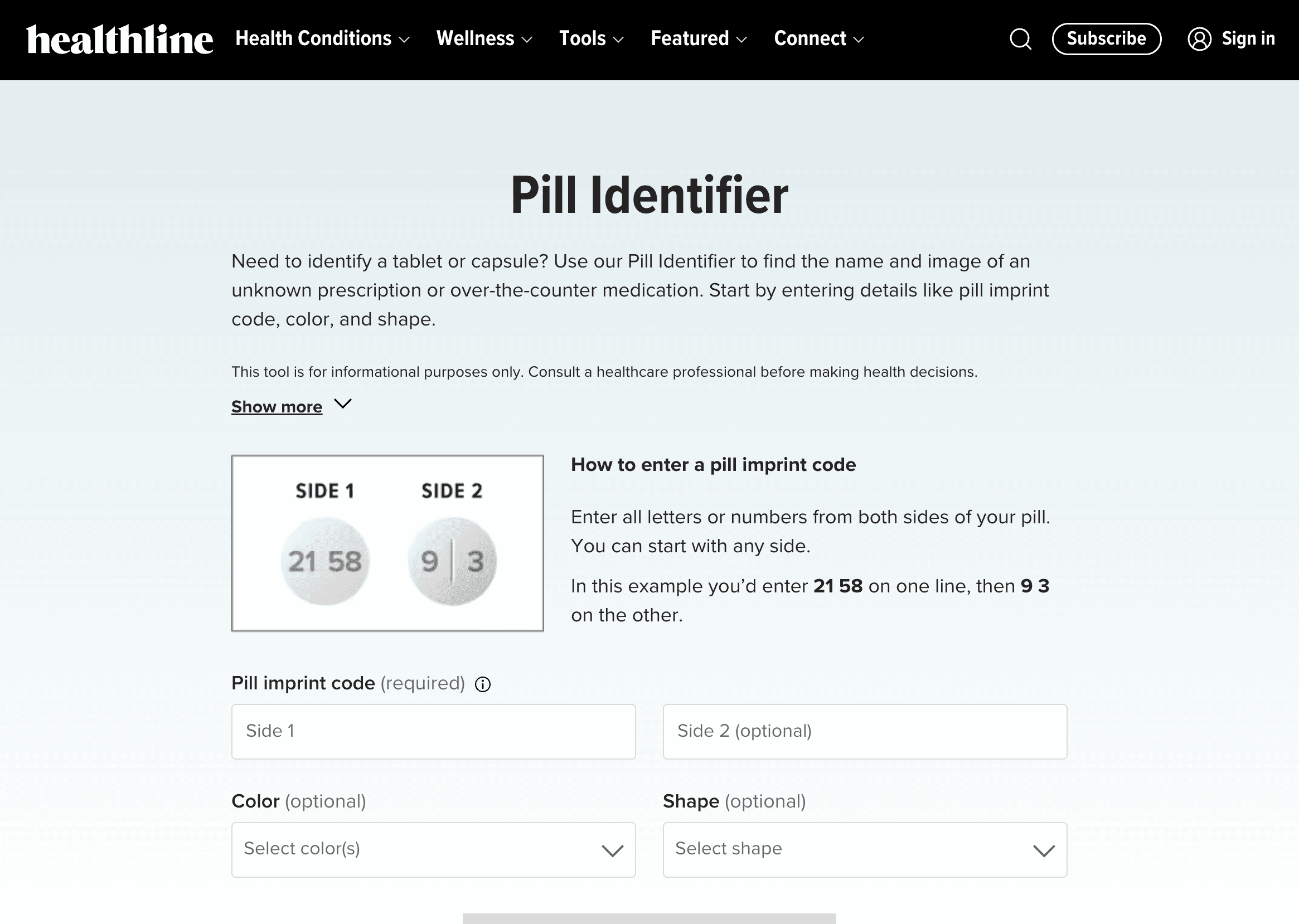
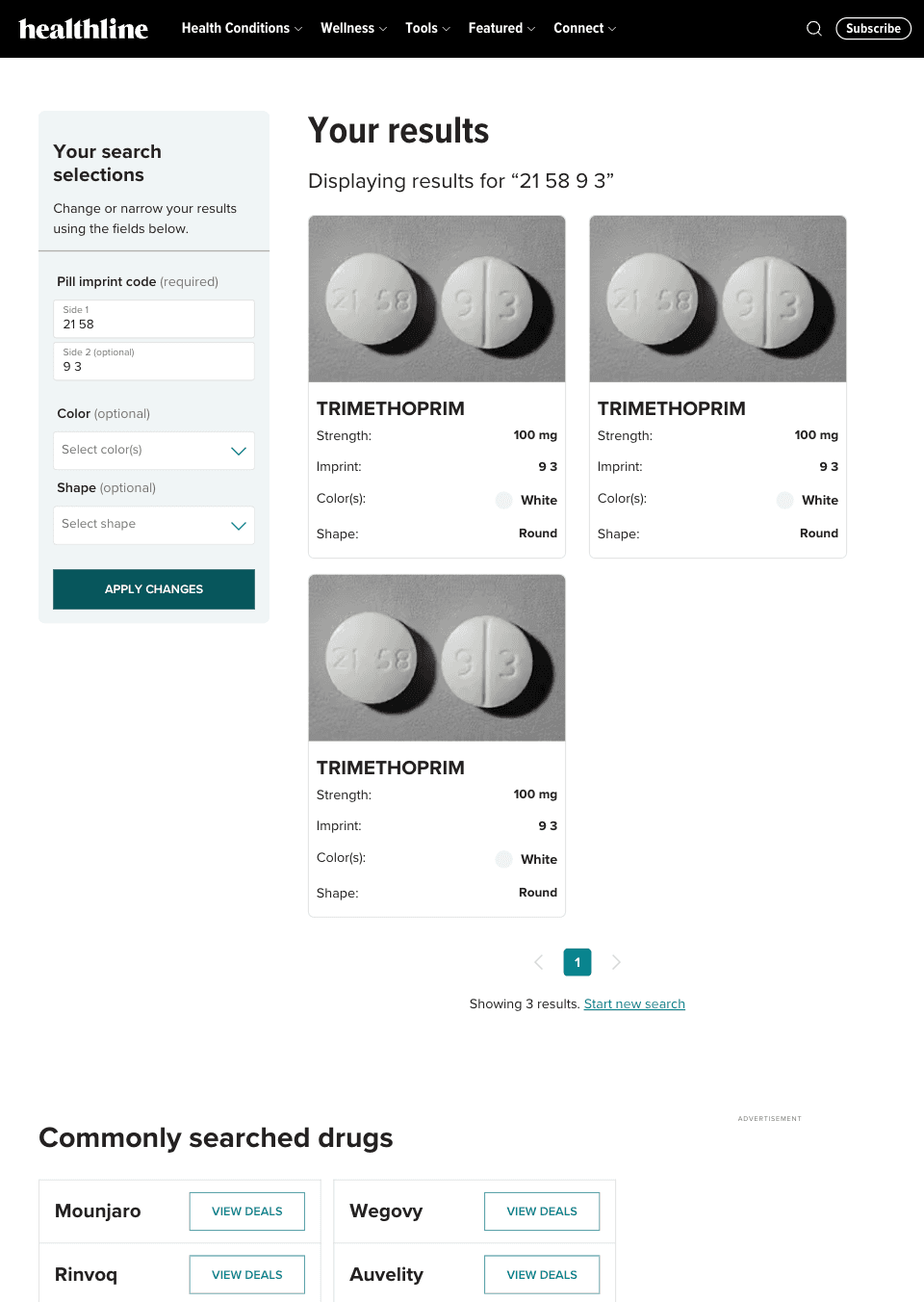
Healthline’s Pill Identifier
The tool lets users enter an imprint code (split across two sides if needed), then optionally filter by color and shape. Imprint results surface even when other filters don't match. Inline guidance explains what an imprint is and how to enter it. Results include a drug image and key medication details.
HOW IT PERFORMED WITH USERS
Moderated usability testing showed promising results in confidence and matching
Performance was on par with established competitors in the space.
Out of 5 participants, none misidentified a pill during testing
In 11 of 15 searches the participant correctly input the pill imprint code on their first try
When a pill was correctly identified, participants felt confident in the result through self-evaluation on a scale of 1-5
THE OUTCOME
Organic traffic grew steadily from launch and gave Healthline an entry point in pill identifier search results
10,227 unique page visits post launch
#7 SERP ranking for users searching for “pill identifier”
37% of users found a matching result
6% clicked through to read further drug details (on drugs with corresponding overview pages on Healthline)


Redesigning the core insurance marketplace for Marble
TOOLS
Figma
Maze
Otter
TIMELINE
3 week sprint completed during General Assembly’s UX Design Immersive
TEAM
4 UX design students
THE BRIEF
Client Capstone: validating Marble’s shopping and marketplace flow
Shopping for insurance can surface a number of emotions: frustration, confusion, and exasperation. Marble sought to change that by giving members the tools to consolidate their independent insurance policies in a digital wallet and easily compare rates and coverage.
As a team of 4, we redesigned Marble's insurance marketplace desktop website by identifying points of user frustration and updating their interface to improve how users search and compare insurance quotes.
CONTEXT
Putting Marble’s designs to the test with real users
Marble's shopping partner lacked competitively priced options and users largely associated their long and tedious intake process with Marble, despite it being something they had no control over. As a result, Marble began the process of separating from their shopping partner and designing a potential flow for users to browse insurance options within the Marble site.
However, they did so without conducting any user research or conducted any usability testing and were unsure if their “shopping cart” concept would resonate with their members.
INSIGHTS
Uncovering points of friction with users
To establish a baseline understanding of Marble's existing "Shop" screens, we conducted three rounds of usability tests with 35 total participants,. This allowed us to get an idea of what was or wasn't resonating with users when trying to complete the tasks associated with Marble's key "Shop" features: open shopping carts and set a reminder. We also wanted to evaluate members' clicking tendencies to see if they were drawn to click on "Get Quote", an integral aspect of Marble's revenue stream.
We saw that all of the participants had difficulty connecting a shopping cart with browsing for insurance options and skipped the feature completely.
Marble’s set a reminder functionality served an integral part in motivating members to return to Marble to do their shopping at a later time. Usability participants had a hard time locating the CTA to initiate the process because it was only accessible on the "Shop" page. We noticed that most participants looked for it on the Home page, then searching under "Tools" or their account.
THE SOLUTION
A cleaner insurance marketplace landing page with clear pathways to search
Utilizing Marble’s existing design system, we delivered a solution to meet the needs of both existing and prospective users and aligned with their mental models related to the insurance shopping experience. Key features included:
Saved quote searches for shoppers to pick up right where they left off
Integrated insurance information into the shopping experience from Marble’s “Insurance Insider”
Good deal rating to help members make an informed decision on their next purchase
HOW IT PERFORMED WITH USERS
More focused clicks and faster task completion in unmoderated testing
Marble’s original layout
Redesigned quote search layout
Clicks on our redesign (right) were much more concentrated and darker where we wanted them to - in creating quote comparisons. This meant fewer misclicks and that the majority of participants were being directed to the right areas of the page.
Time on task also decreased by 37 seconds, meaning that there was less hesitation when landing on the new "Explore Quotes" page and participants were able to quickly determine their next step.
THE OUTCOME
Simplifying how members search and compare quotes
We observed 42% more direct task completions
Participants completed tasks 38 sec faster
Participants gave our flows a 4.4/5 easy rating (compared to 3/5 before the redesign)
“In the coming months we will be prioritizing the implementation of Stephanie’s work and given the research already done, I’m excited and confident about the impact it will have on our product conversion and satisfaction.” — Stuart Winchester, Marble CEO
Redesigning the core insurance marketplace for Marble
TOOLS
Figma
Maze
Otter
TIMELINE
3 week sprint completed during General Assembly’s UX Design Immersive
TEAM
4 UX design students
THE BRIEF
Client Capstone: validating Marble’s shopping and marketplace flow
Shopping for insurance can surface a number of emotions: frustration, confusion, and exasperation. Marble sought to change that by giving members the tools to consolidate their independent insurance policies in a digital wallet and easily compare rates and coverage.
As a team of 4, we redesigned Marble's insurance marketplace desktop website by identifying points of user frustration and updating their interface to improve how users search and compare insurance quotes.
CONTEXT
Putting Marble’s designs to the test with real users
Marble's shopping partner lacked competitively priced options and users largely associated their long and tedious intake process with Marble, despite it being something they had no control over. As a result, Marble began the process of separating from their shopping partner and designing a potential flow for users to browse insurance options within the Marble site.
However, they did so without conducting any user research or conducted any usability testing and were unsure if their “shopping cart” concept would resonate with their members.
INSIGHTS
Uncovering points of friction with users
To establish a baseline understanding of Marble's existing "Shop" screens, we conducted three rounds of usability tests with 35 total participants,. This allowed us to get an idea of what was or wasn't resonating with users when trying to complete the tasks associated with Marble's key "Shop" features: open shopping carts and set a reminder. We also wanted to evaluate members' clicking tendencies to see if they were drawn to click on "Get Quote", an integral aspect of Marble's revenue stream.
We saw that all of the participants had difficulty connecting a shopping cart with browsing for insurance options and skipped the feature completely.
Marble’s set a reminder functionality served an integral part in motivating members to return to Marble to do their shopping at a later time. Usability participants had a hard time locating the CTA to initiate the process because it was only accessible on the "Shop" page. We noticed that most participants looked for it on the Home page, then searching under "Tools" or their account.
THE SOLUTION
A cleaner insurance marketplace landing page with clear pathways to search
Utilizing Marble’s existing design system, we delivered a solution to meet the needs of both existing and prospective users and aligned with their mental models related to the insurance shopping experience. Key features included:
Saved quote searches for shoppers to pick up right where they left off
Integrated insurance information into the shopping experience from Marble’s “Insurance Insider”
Good deal rating to help members make an informed decision on their next purchase
HOW IT PERFORMED WITH USERS
More focused clicks and faster task completion in unmoderated testing
Marble’s original layout
Redesigned quote search layout
Clicks on our redesign (right) were much more concentrated and darker where we wanted them to - in creating quote comparisons. This meant fewer misclicks and that the majority of participants were being directed to the right areas of the page.
Time on task also decreased by 37 seconds, meaning that there was less hesitation when landing on the new "Explore Quotes" page and participants were able to quickly determine their next step.
THE OUTCOME
Simplifying how members search and compare quotes
We observed 42% more direct task completions
Participants completed tasks 38 sec faster
Participants gave our flows a 4.4/5 easy rating (compared to 3/5 before the redesign)
“In the coming months we will be prioritizing the implementation of Stephanie’s work and given the research already done, I’m excited and confident about the impact it will have on our product conversion and satisfaction.” — Stuart Winchester, Marble CEO